
The anatomy of a lead generation landing page that converts
A lead generation landing page converts when it matches the ad's promise, proves you can deliver, makes one clear offer, and asks for only the information you need. Build it mobile-first, load it in under three seconds, remove navigation links, put the form or button above the fold, answer the top objections, and track every submission as a conversion.
Key takeaways
- One page, one offer, one action.
- The headline should repeat the ad's promise.
- Proof beats claims: results, reviews, recognisable clients.
- Fewer fields usually convert better; qualify with smart questions.
- Most visitors are on phones: design for thumbs first.
The section order that works
- Headline that repeats the ad promise and names who it's for.
- Sub-headline with the outcome and timeframe.
- Primary call to action visible without scrolling.
- Proof: numbers, reviews, logos, photos of real work.
- How it works in three steps.
- Offer details: what they get, price or range, what happens next.
- Objections answered as an FAQ.
- Final call to action and contact options (call, WhatsApp).
Form design
| Do | Avoid |
|---|---|
| Name, phone, 1 to 2 qualifiers | Address, company size and job title all at once |
| Choice buttons for budget or timeline | Long dropdowns |
| Clear button text: “Get my quote” | “Submit” |
| Thank-you page with next steps | A silent form reset |
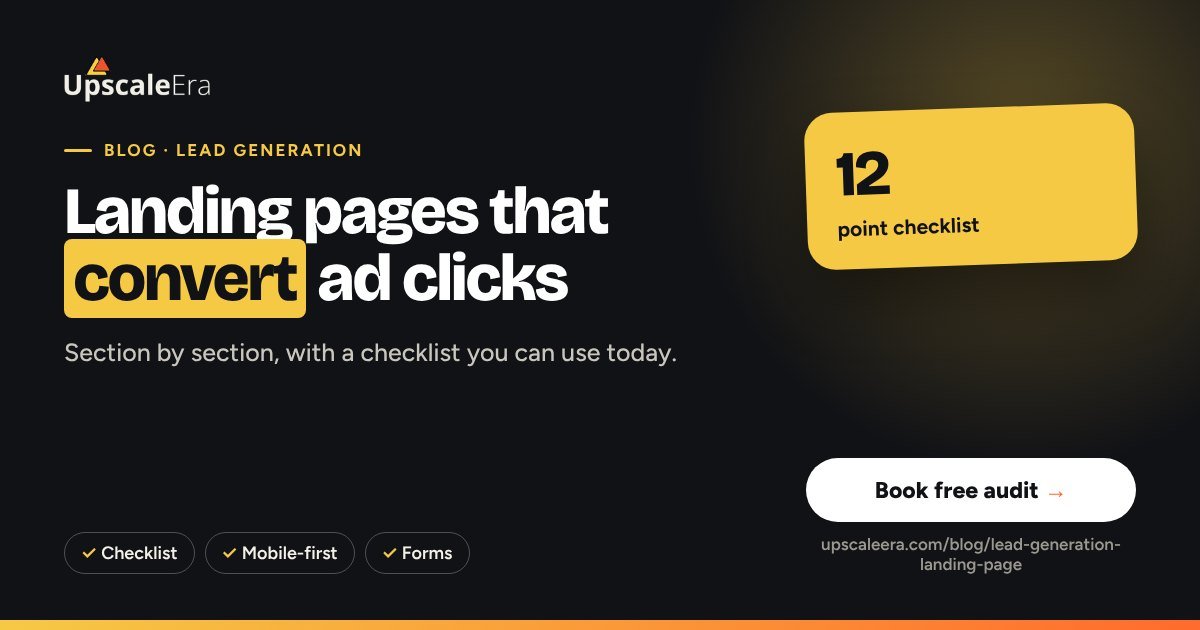
The 12-point checklist
- Loads in under 3 seconds on mobile data
- Headline matches the ad
- No main navigation
- Call to action above the fold
- WhatsApp and call buttons on mobile
- At least three forms of proof
- Price or range mentioned
- FAQ answering top objections
- Form has 3 to 5 fields
- Thank-you page fires the conversion event
- Pixel + Conversions API and GA4 set up
- Leads flow to a CRM instantly
Test what matters
Test big things first: the offer, the headline and the form length. Button colours rarely matter. Run one test at a time and wait for enough conversions to be confident. Our website and CRO team builds and tests pages like this.
Common mistakes to avoid
- Headline that doesn't match the ad
- Long forms asking for details you don't need yet
- No proof above the fold
- Slow images that load after the visitor leaves
- Thank-you page that doesn't fire the conversion
Your 30-day action plan
- Week 1: audit your current page on a phone using the 12-point checklist
- Week 2: rewrite the headline, proof and offer sections; cut the form to essentials
- Week 3: fix speed and tracking (Pixel, CAPI, GA4) and launch
- Week 4: run one A/B test on the headline or the offer
Want a second pair of eyes? Book a free Growth Leak Audit and we will review your numbers with you.
Our lead-generation system, built on the Sales-Signal Loop™: your sales feedback trains the ads every week. Judged on qualified appointments, not cost per lead.
See how it works Cost per sale calculatorHow we handle this at UpscaleEra
In our Growth Leak Map™, the landing page is the Capture stage. We build it to cut friction without dropping the questions that separate buyers from browsers, and we connect it to your CRM or WhatsApp so every enquiry reaches a person within minutes.
Frequently asked questions
Should I send ads to my homepage?
Usually no. A dedicated page for one offer converts better because it removes distractions.
How many form fields are ideal?
Ask for the minimum needed to contact and qualify: often name, phone and one or two qualifying choices.
Does page speed affect leads?
Yes. Slow pages lose visitors before they see the offer, especially on mobile data.
WhatsApp button or form?
Offer both. Some buyers prefer to chat; route WhatsApp chats into the CRM too.